In this post, along with the next few posts, I will be discussing a hypothetical case where data has been provided and your job (as the analyst) will be to create a quarterly report detailing sales of 2018 new vehicles in Canada. This post will use a pivot table to extract the data from the data source.
The purpose of this post is not to discuss the trend of sales of cars in Canada, but instead to provide methods for creating a quarterly analysis using Excel-based methods.
This is the 2nd post using this quarterly report; the first uses the SUMIFS() formula and is available at https://macrordinary.ca/2019/10/29/the-quarterly-report-using-sumifs/.
The Data Set
The data set that we will be using is the 2018 new motor vehicle sales, which is publicly available at Statistics Canada. https://www150.statcan.gc.ca/t1/tbl1/en/tv.action?pid=2010000101
I have made this information available through a .CSV file available on this site:
Car Sales
The top of the data set should look as follows, with the first 2 columns being REF_DATE and GEO.

Relevant columns in the data set for this analysis include:
- REF_DATE – The month where data is being measured.
- GEO – The geographic region (province or country).
- Origin of manufacture – This shows where the vehicle was made.
- Vehicle type – The type of vehicle being measured (truck or passenger car).
- UOM – Unit of measurement; units or dollar sales.
- Value – The total amount of sales. (in units or thousands of dollars, depending on the unit of measurement)
The Report
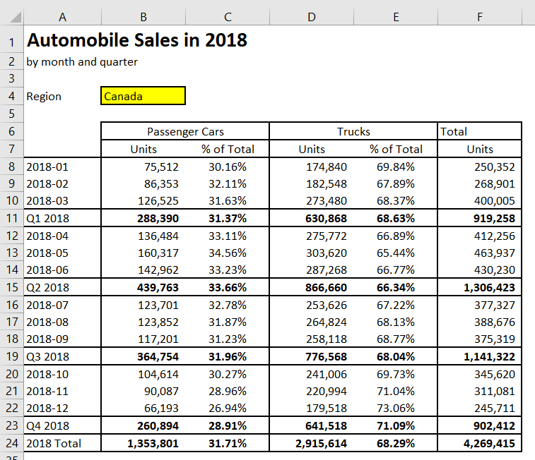
The objective of the analysis is to generate the same report as the image below. It must have the following features:
- The report will show the number of units and the percentage of total units sold by vehicle type in a given period.
- Results must be able to be viewed on a monthly, quarterly and annual basis.
- Results must be broken down by both vehicle types, Passenger Cars and Trucks.
- A filter must be available to show results by region.
- Quarterly and total results must be in bold.
- Quarterly and total results must have top and bottom borders.

Now that we know what we are trying to build, it’s time to start building the report!
Step 1 – Importing the Data into a Pivot Table
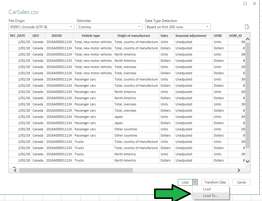
The best way to get the data from the .CSV file is to import using the “From Text/CSV” option under the Data tab.

The CarSales CSV file should be available for import after you have navigated to the correct directory.

Once the results are showing, change the load option to “Load To…”

Since there is no need to have the data table in the spreadsheet (like with a SUMIFS() formula), the data should be represented by a PivotTable report.
Also, it will be important to keep the pivot table on the same sheet, so change the option from New worksheet to Existing Worksheet. The range can remain as =$A$1.

Step 2 – Adding the value to the Pivot Table
Congratulations! You now have a blank pivot table. The first step will be to add the value field to the pivot table.

This is done by selecting the Value field from the pivot table selector. Once this is complete, you will see your blank pivot table replaced by one with the Sum of Value.

Select the value field. 
The value field should be the only one selected. 
716 million cars! Time to start breaking that number down!
Step 3 – Adding the rows and columns to the pivot table.
To start making our pivot table, we will add the vehicle type for columns, and the dates for rows.

Note that when completing this, it will create a new Months row. We’ll worry about this a bit later! Once the fields are set up, it will look a lot more like a full pivot table!

Step 4 – Adding the filters to the pivot table.
To make sure that only national total units are captured, some additional filters need to be added to the pivot table. These filters will reduce our number of vehicles to something more realistic!
These filters include:
- GEO – The geographic region (province or country).
- Origin of manufacture – This shows where the vehicle was made.
- UOM – Unit of measurement; units or dollar sales.

Once the filters are added, the pivot table is almost complete!

Step 5 – Setting the pivot table filters
By clicking on the dropdown button, you can select the fields that you need in order to filter out the totals and measures that you do not need in this report.

Set the filters to the following:
- GEO – Set to Canada – this will default to the whole country.
- Origin of manufacture – Set to total; we are not looking at where the vehicle was made!
- UOM – Set to units.

Step 6 – Set up the column filter in the pivot table.
Notice that the Grand Total is duplicating the totals; there is a column in the pivot table that already is a total! To eliminate this duplicate total, click on the column labels filter and uncheck the “Total, new motor vehicles” option.

We now have all the proper data in the pivot table. It’s time to set up the rest of the table to make it look great!

Step 7 – Add the header and output template.
Unfortunately, the pivot table that has been produced cannot replicate the output that was produced using the SUMIFS() formula exactly. As a result, the pivot table will be used for getting the data, but won’t be used for the report output.
First, you will need to add 3 rows above the pivot table and add in the report header.
Next, you will add the template for the report output below the pivot table.
Once these are added, your sheet should look like the sheet below.

Step 8 – Use GETPIVOTDATA() to extract from the pivot table.
Instead of using pivot table to display data, the GETPIVOTDATA() function will be used in order to get the values. A GETPIVOTDATA() function will be added by simply starting a formula with =, then clicking on a cell in the pivot table.
Entering this in cell B27 (January, Passenger cars) using data from cell B10 will return the following:
=GETPIVOTDATA("VALUE",$A$8,"Vehicle type","Passenger cars","Months",1)This function works as follows:
- The first word is the value that the GETPIVOTDATA() function is retrieving, in this case, the VALUE field.
- The second argument, $A$8, is the location of the pivot table on the spreadsheet.
- All arguments after the second argument are field/value combinations of where the number is within the table:
- Vehicle Type: “Passenger cars”
- Months: 1
To make sure that we can use this formula in other cells, the formula can be changed as follows:
- Change Vehicle Type to a cell reference, B$25. This allows the vehicle type to be copied for both cars and trucks.
- Change months to –RIGHT($A27,2). This will capture the last 2 digits of the date (“01”), then converts it to a number (1).
- This assumes that the value 2018-01 is the text from the REF_DATE field, not a typed in date of 01/01/2018. If this is the case, use MONTH($A27) instead.
Once this is complete, your GETPIVOTDATA() formula should look as follows:
=GETPIVOTDATA("VALUE",$A$8,"Vehicle type",B$25,"Months",--RIGHT($A27,2))You can copy the GETPIVOTDATA() formula into all data in the table to create a table like the one below.

Step 9 – Aggregating quarterly values with SUBTOTAL().
While it might be tempting to use a SUM() function to add up the quarterly values, it is better to use a SUBTOTAL(9,[Cells]) formula, like the one seen below.
=SUBTOTAL(9, B27:B29)This formula can be copied into every quarter in columns B and D.
Once this is complete, a SUBTOTAL() can be added for all months in column B and D (including the prior subtotals), reducing the risk of a quarter not being properly captured.
=SUBTOTAL(9, B27:B42)At this point, your report will look as follows:

Step 10 – Getting total units.
Since the quarterly balances are not available on the pivot table, the best (and simplest) way to get the total values is to simply sum the two columns.
=SUM(B27, D27)Copy that formula down from row 27 to row 43, and you should have everything ready except the percentages.

Step 11 – Fill percentages by dividing months by columns.
Finally, you need to fill in the percentage of the total for both passenger cars and trucks.
This is done by dividing the units column by the total column, making sure to use absolute referencing for column F.
=B27/$F27Once these percentages are copied for all cells, all data is now in the report! Congratulations! There are just a couple more things to clean up before we are done.
Step 12 – Hide the pivot table and change formatting.
Since we don’t want end users interacting with the pivot table, we need to hide some functionality from the pivot table.
First, hide rows 5:22. This will hide all the data fields, along with all the filters that we don’t want the users interacting with.
Next, right click on the pivot table and select PivotTable options. In this menu uncheck the Autofit column widths on update. This will make sure that the cells won’t move when a region is selected with a long name.

Step 13 – Rename the GEO field to Region.
The field name may make some sense to a user, but the initial request was to have the field for selection be named “Region”. By right clicking on cell A4 (GEO), you can select Field Settings.

Within Field Settings, the field can be renamed – in our case, we will be renaming the field to Region by providing a custom name of Region.

And now, you’re done, congratulations! This was a lot of steps to complete – but the source data is not needed in the spreadsheet, and you have a professional-looking product!

Next Steps
The next way that we will be producing this table is using the data model and the CUBEVALUE() function – this will be using some new formulas and exciting ways to get the data in a presentable format!

