Skip to content (Press Enter)
  • Home
  • Services
  • Blog
  • Case Studies
  • About Me
Macrordinary

Macrordinary

  • Home
  • Services
  • Blog
  • Case Studies
  • About Me
Home>dashboards

Tag: dashboards

Updated on November 18, 2020November 18, 2020/ Brent Allen

Make a KPI Card like Power BI – In Excel!

Make a KPI Card like Power BI – In Excel!

In Power BI, one of the frequently used visuals is a key performance indicator, or KPI card. It allows to quickly hone in on key values for your dashboard. To avoid overwhelming users with incredibly high values, numbers are also …

Read More
Updated on March 4, 2020March 4, 2020/ Brent Allen

Using Shapes for Better Dashboards

Using Shapes for Better Dashboards

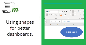
In most cases when working with data in Excel, you will be adding data directly into cells, or deriving data through pivot tables or formulas. But when working with dashboards, it is important to consider visual elements for end users. …

Read More

Recent Posts

  • LET Function in Excel: A Name Parsing Example
  • Make a KPI Card like Power BI – In Excel!
  • Top N Results from Excel using Dynamic Arrays
  • DA-100 – The Certified Data Analyst Exam
  • Ranges in Office Script – They are different than VBA!

Categories

  • dashboards
  • excel
  • financial formulas
  • formulas
  • M
  • office script
  • pivot tables
  • power apps
  • power bi
  • power pivot
  • power platform
  • power query
  • scripts
  • VBA
Copyright © 2021 Macrordinary. Software Company | Developed By Rara Theme. Powered by WordPress.